Deconstructing StashAway App (1)

I came across stashaway.com while listening to a investing podcast called The Financial Coconut.
Essentially, StashAway is "an intelligent wealth management platform that's designed to build and protect" the investors' wealth who parked their money with them.
I overheard that their UI is quite user-friendly and minimalistic, thus I signed up for an account with them so I can access and explore the system.
At the same time, I would like to make a little practise to mock up the system with as many sections as I can with my access rights and no money deposited.
While I signed up using the app, I accessed the system on the desktop via the browser. I've made screenshots for the sign up flow but have yet to mock them up.
Below are the desktop mockups which I made in Figma.
Login / Signup
Their login and sign up page is truly minimalist, with all the essential components displayed:
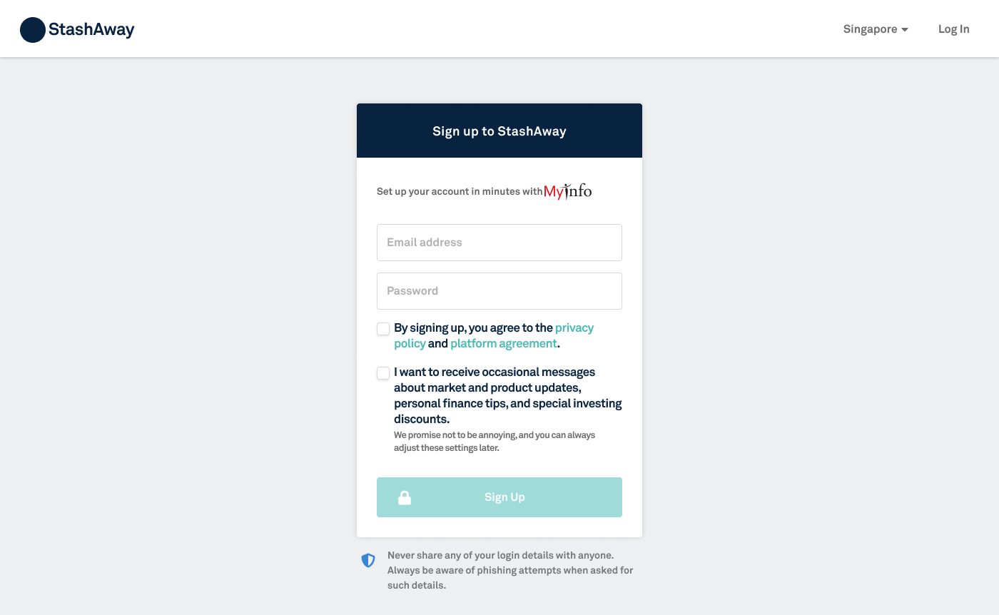
More and more Singapore apps are providing users with the ability to sign up using MyInfo and allowing them to access certain details of the user's profile. This saves time rather significantly by auto-populating those fields such full name, identification number, DOB, etc...
When the user selects the MyInfo option they will be brought to another government app called SingPass for user verification and access right permission granting.
The user verifies via SMS OTP, password or fingerprint, and a path is connected between StashAway and the user details.
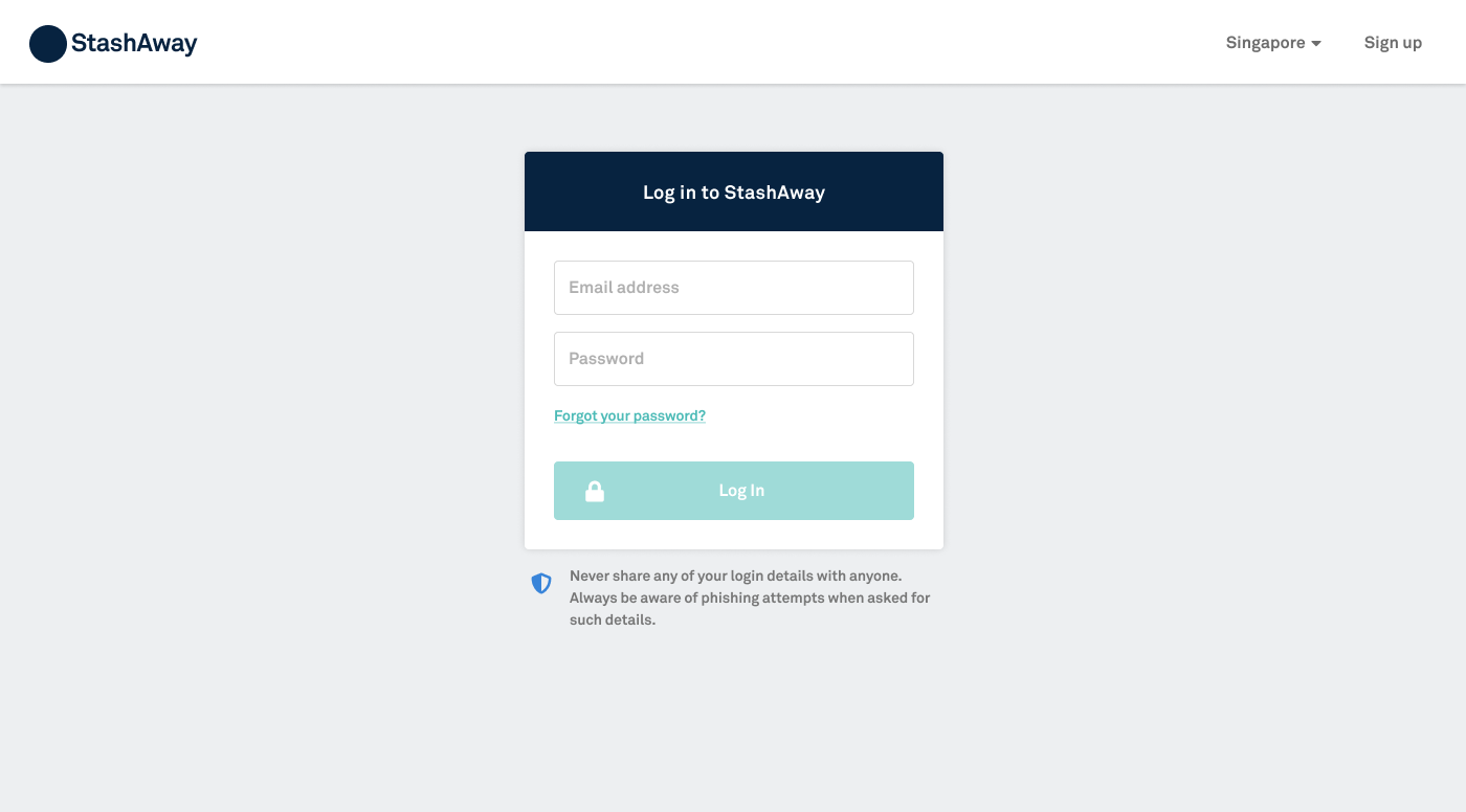
I can see that this app forgoes the option for user to sign up/login using via FB, Google or Apple. I'm guessing it's for security reason in case any of those social media accounts are being hacked into.
So is the option to "remember" the user's login credentials.
Password Reset
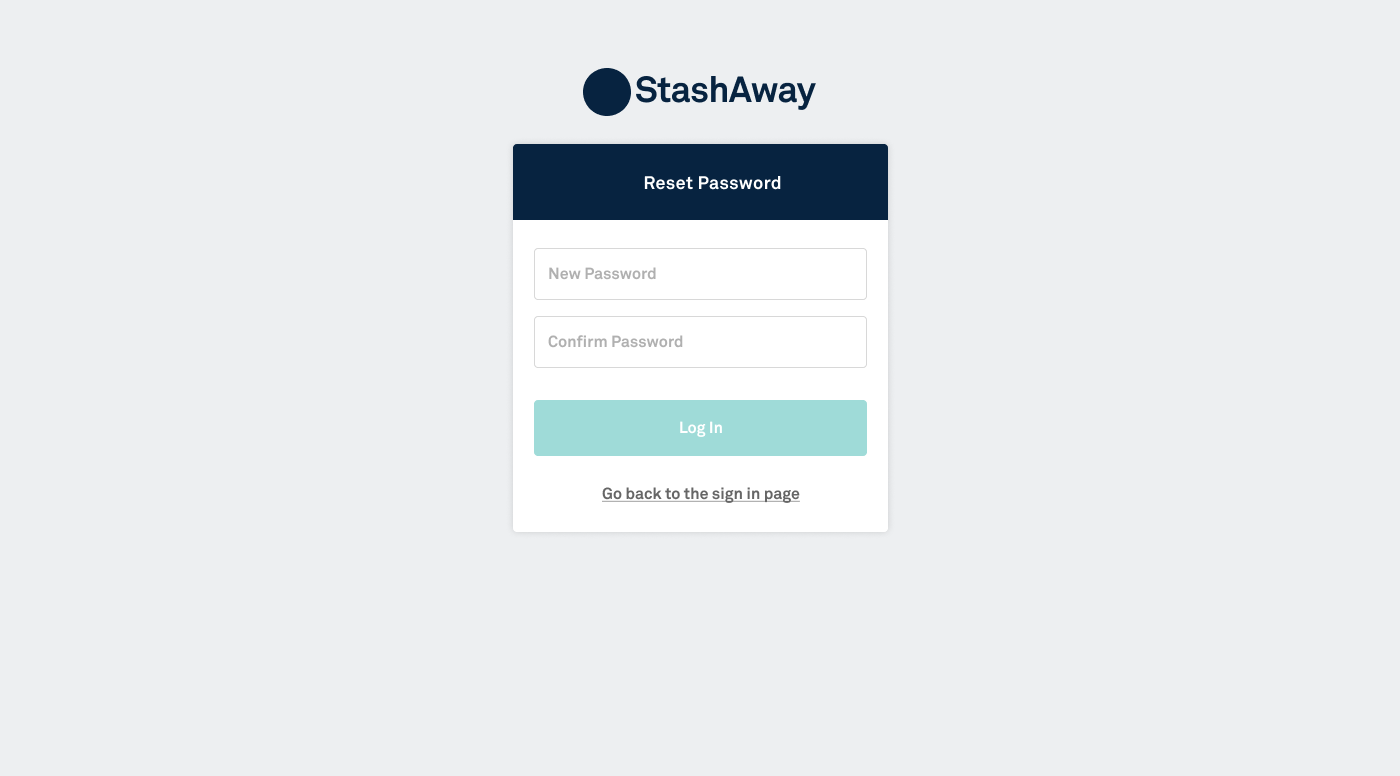
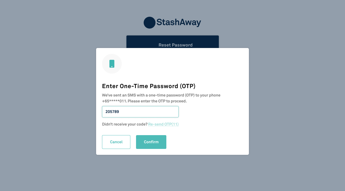
After the user resets their password, an OTP is sent to the user's SMS for 2nd verification. If the OTP code is incorrect or the user clicks "Cancel", the reset operation will be terminated.
Homepage (Portfolios)
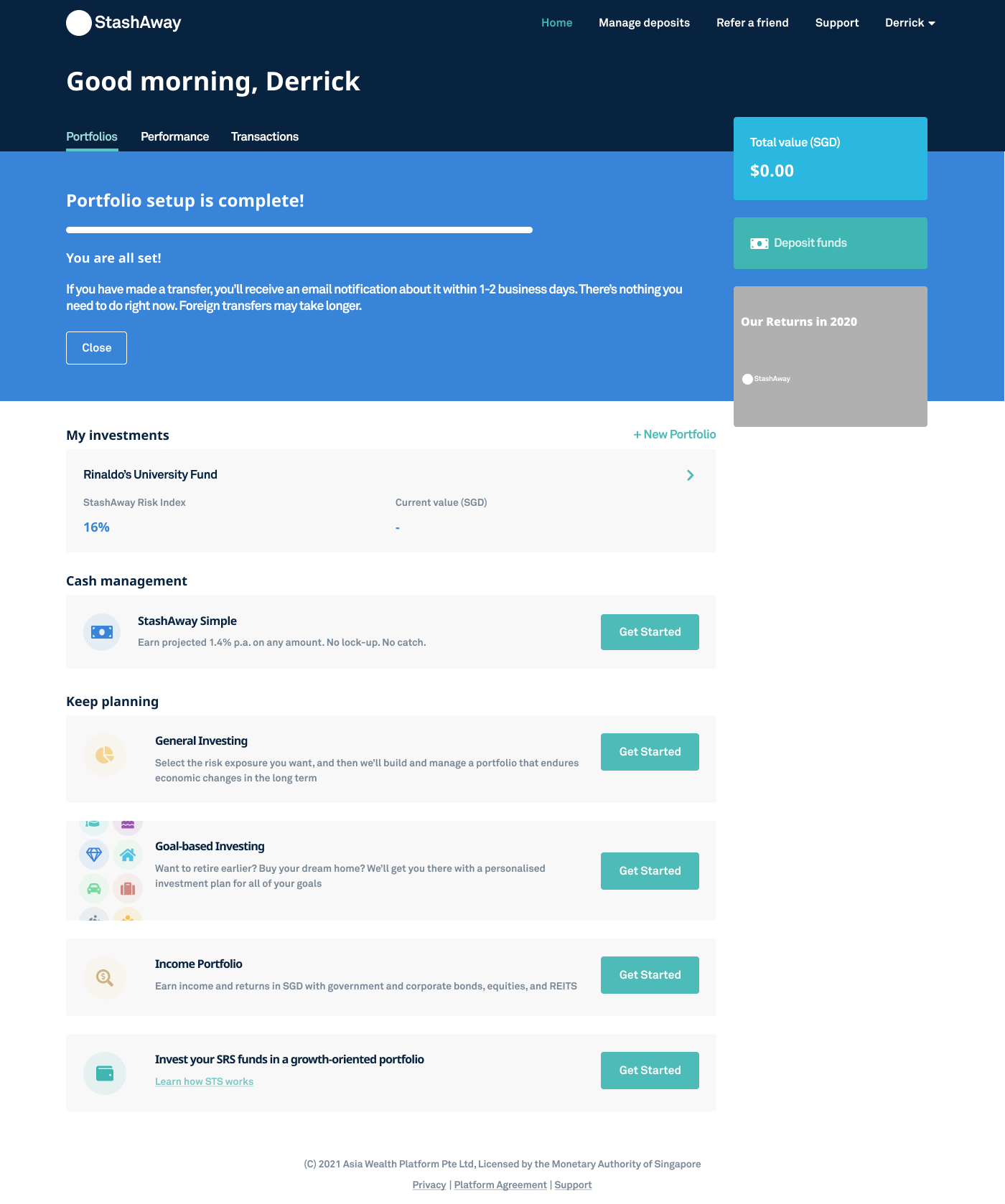
The top nav section is in their primary dark blue, which coolors.co refer as "Oxford Blue", followed by the greetings.
The main content section is a "3/4 + 1/4" column with lots of whitespace, and they are using Cards with muted background as primary mode of displaying content and CTAs.
CTA buttons are in all green (or "Verdigris" according to Coolors), including the chevron arrows for clicking to view more details about each card. That includes the text links so there's no recognitive load on the users part to guess if something is a link or not.
If it's green, its clickable. 🤟
Performance Page
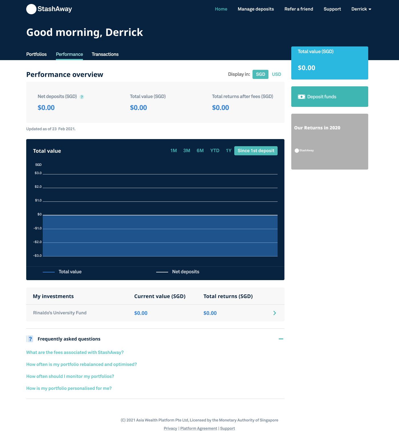
Graphs are displayed with the Oxford Blue which creates a good contrast with the other cards.
What's exceptionally interesting for me is the dropdown, which has both "light" and "dark" shadow simultaneously:
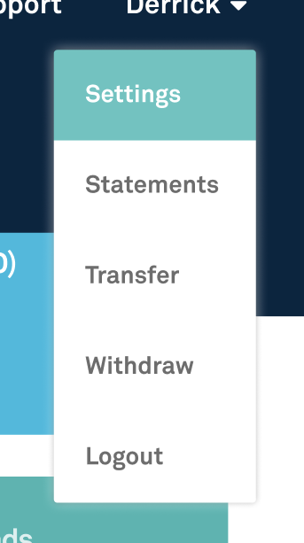
The "light" shadow makes the dropdown glow against the dark background which the "dark" shadow allows it to float above the light background.
That's all I have to share today. Till next time, cya!