UI Refactoring of the Auto-Scheduler section

We have a very cool function in our software that helps the users to optimize their schedule based on certain criteria.
For the past few months, we are very much focused on getting the algorithm working for the user, so the visual aspect was kind of neglected.
Now that this function was working quite stably, I have a some spare time to do some UI housekeeping.
This is how the states look like currently:
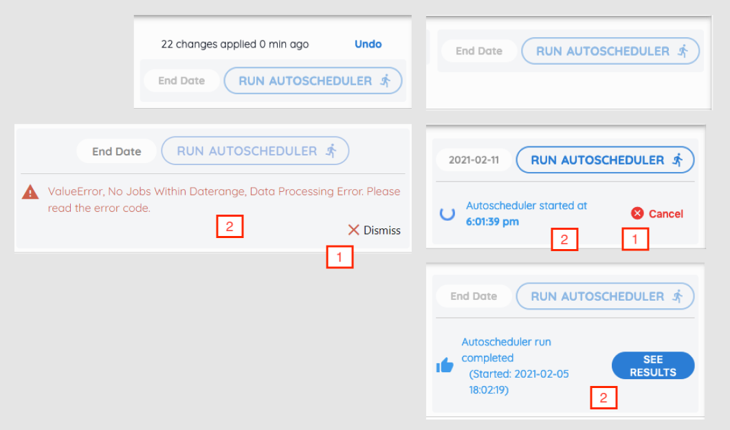
The "Status" section was quite poorly designed, and is partly my own fault.
1) Inconsistent UI components for similar actions.
For example, the icons for the "Cancel" and "Dismiss" button are inconsistent. Sames goes for the font weight of the text "Dismiss", "Cancel" and "See Results".
2) Inconsistent alignment of content and button.
When the optimizer and processing and when it's completed, the icon + content is on the left while the button is on the right. The output has to take up 4 rows due to lack of space.
When there's an error, the icon + content takes up the whole width and the button is on the 2nd row.
3) Button text too long
It's been bugging me for some time now: that the button to click and run the optimizer algo is too long! And it includes an icon too!

After
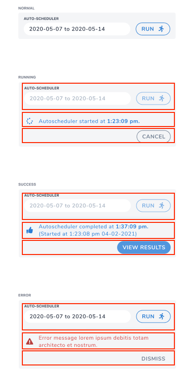
What I did first is to group all the components into sections which covered all the statuses. So now the icon + text takes the full width and the action button is moved to the last row.
By placing the button on it's own row allows it to have ample space when more text is required, e.g. "View Results", without wrapping to 2 rows.
Having the text taking full width makes reading them easier.
Second. I removed the icon for the "Dismiss" and "Cancel" buttons, which I think was not that required initially too. I also changed the color of these 2 buttons to grey as they are not destructive actions, they don't need to draw too much attention from the user.
The only difference between them is that for the "Cancel" button, it has a grey border to have a little more emphasis.
Lastly, I shortened the "Run Autoscheduler" button to only "Run" and placed the "Auto-Scheduler" text as the input field title.
Undo section
When the user applies the suggested schedule, they have the option to undo that action within a certain period.
For that, I'm still not sure where to place them: either above (Left) or just below (Right) the "Run" auto-scheduler button:
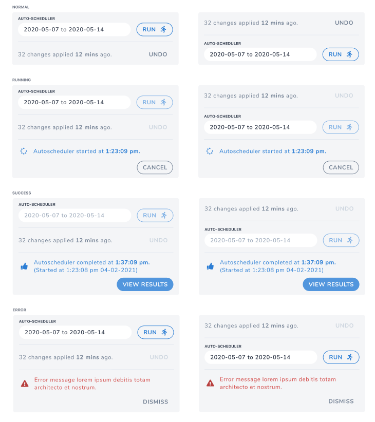
I personally prefer it to be at the top because to have it below the "Run" button will break the flow of the operation: Run -> View Results.
Well I guess the next logical step is to show this screen to the users and ask for their feedback: which one would they find it easier to see the info that they need.
That's all for now. C'ya!